IPL 2023: Ranking top 10 logos
A well-designed logo can create an emotional connection with fans and help establish a sense of community.
12 Min Read


The Indian Premier League 2023 is underway, and the tournament has delivered some exciting contests so far. A total of ten teams are there competing for the trophy again this year. It is challenging to predict the winner, considering each team has performed well so far. However, if you support a particular team, you probably believe they will emerge victorious and claim the trophy.
Being a die-hard fan of an IPL team is a challenging task. Each year teams make some significant changes to the squad, and then as a fan, you need to review these changes to understand how the new players will impact your favorite team's performance. Some franchises make changes to the jersey each year, and try to inculcate innovative ideas in their outfits. Nevertheless, team logos are typically left unchanged, as they represent a critical aspect of a team's identity that is rarely altered.
A logo is not just a symbol for a franchise; it tells a story that fans understand and resonate with. A well-designed logo can create an emotional connection with fans and help establish a sense of community. Additionally, a team's logo can have a significant impact on merchandise sales, as fans often want to show off their loyalty by wearing clothing or accessories featuring their team's logo. As a result, franchises often invest significant time and resources into developing and refining their logo to ensure that it accurately represents the team and resonates with fans.
Here, we have ranked the logos of all 10 IPL teams this season:
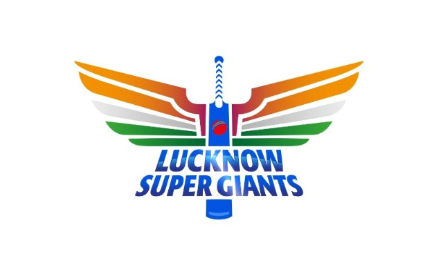
10. Lucknow Super Giants (LSG)- {7/10}

The logo of the Lucknow Super Giants contains a bat in the middle with a ball engraved in the center of the bat. The bat has wings on both sides, and the Indian Tricolour has been used as an inspiration for the color of the wings. The design of the wings has been inspired by the mythical bird Garuda, which has the ability to fly quickly. The bird Garuda can be found in all Indian cultures and sub-cultures.
The bat in the middle is blue in color, while the color of the ball is red with an orange seam. The design of the ball resembles the auspicious ‘jay tilak,’ which is associated with good luck in Indian homes. The tri-color in the wings has been used to represent the franchise’s Pan-India appeal. The logo has been heavily inspired by Indian mythology.
The logo has been carefully designed, and each element carries significant meaning. In their first year, the Sanjeev Goenka-owned team donned a aqua marine blue colored jersey and made it to the playoffs. This season, the color of the jersey has been changed to dark blue, but the logo remains the same. They had a flying start to the tournament as they overcame the challenge of Delhi Capitals before losing their second game to CSK.
Download Our App