IPL 2023: Ranking top 10 logos
A well-designed logo can create an emotional connection with fans and help establish a sense of community.
12 Min Read
8. Mumbai Indians (MI)- {8/10}

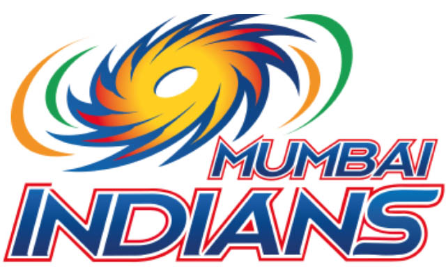
The Mumbai Indians made a few minor changes to their logo from their initial years in 2010, which is still in use. The logo has been heavily inspired by Sudarshana Chakra, attributed to god Vishnu in the Hindu scriptures. The franchise is known for consistent performances in the tournament and has won the trophy five times. The same consistency is present in their logo design as the original idea and colors are still in use.
The first logo of the team was created in 2008. The initial logo had the Chakra sign at the top of the franchise's name. The Chakra was in blue and yellow-to-red colors, with blue and red letters and white outlines. On the left side of the logo, two orange and green strokes were used to represent the Indian flag.
In 2010, the logo was updated with some minor changes and an enlightened color palette. The Chakra was turned in the opposite direction from the original logo. In the initial logo, the sharp blades on the Chakra were turned to the left, while in the new logo, it can be seen swirling to the right side. The orange and green strokes, which were only one side of the Chakra, are now on both sides in the new logo.
Download Our App