IPL 2023: Ranking top 10 logos
A well-designed logo can create an emotional connection with fans and help establish a sense of community.
12 Min Read
6. Punjab Kings (PBKS)- {8/10}

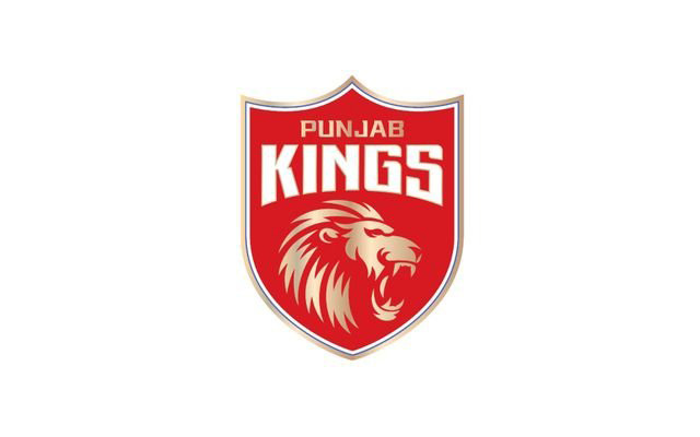
The franchise was known as Kings XI Punjab earlier and changed their name to Punjab Kings before the 2021 edition of the Indian Premier League. Despite the name change, the team has consistently combined red and white colors in the logo, while gold color was introduced later. The team's primary logo has been inspired by a shield, and the current logo reflects this.
The older logo featured two lion heads facing in opposite directions, which was replaced with a single lion image in the current logo. The golden lion is in the logo's center against a solid red background. The franchise's name is now placed in the upper section of the logo in two different lines. The name is etched using different styles and colors, with gold and white being used.
This season, the Punjab-based franchise announced Shikhar Dhawan as their captain and won the opening game against the Kolkata Knight Riders by seven runs. They posted a total of 191 runs for the loss of five wickets with the help of a half-century from Bhanuka Rajapaksa. Arshdeep Singh picked three wickets for 19 runs in three overs and was adjudged Player of the Match. The Kings have never been successful in winning the trophy, and they will be hoping to change this record under a new captain.
Download Our App