IPL: Rating top 10 team logos of all time
Having more than 14 teams associated in the history of the IPL, and an endless count of variations and logos of the franchises, let's look at the top 10 of all time.
10 Min Read
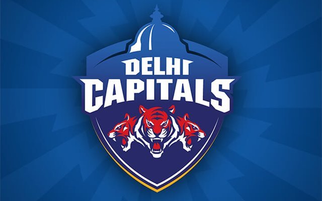
6. Delhi Capitals (DC)– 8/10

2019 saw a new Delhi. A new name. A new logo. A new feel. A change in the Delhi brand brought a change of fortune as the team went on to qualify all the playoffs ever since. Just like the team evolved into a squad having a fine mix of youth and experience, the logo evolved drastically too.
Delhi Capitals sported a newly designed logo as part of their rebranding. The combination of the three roaring tigers, the bold DC text, and the parliament made it a power logo. Placed at the head, the Parliament in Delhi’s logo represents the powerhouse where the pinnacle of the action takes place. The body of the logo encompasses three dominating tigers, the national animal of India, symbolising the hunger to win and the aggression the team thrives on.
A combination of blue and red essentially exhibits the team’s nature of being conservative while being full of power and a tinge of yellow showcasing the squad’s warm spirit. The Delhi team has managed to live up to its hype these last few seasons and has played a dominating brand of cricket. The fighting and red hot spirit of the team is symbolised through their logo, giving it a rating of 8/10.
Download Our App